


Overview
Background of project
As the sole Product Designer, I led the end-to-end research and redesign for CAA's membership checkout flow.
Our current checkout flow has been untouched for over 8 years. The business wanted to create an experimental flow using a new CMS (Content Management System) that could constantly be used to A/B test against out existing flow.
Business objectives
-
Decrease abandonment rate
-
Increase transactions
-
Decrease number of existing members entering the flow
Design process

01
Empathize
The Challenge: A high-friction, outdated checkout experience
I initiated a research plan to identify the primary pain points and uncover opportunities for improvement.
Research methods
1. Usability testing
At CAA, usability testing wasn't a standard practice. I saw an opportunity to demonstrate its value by piloting a study on the existing checkout flow. The goal was to find the pain points within our existing end-to-end checkout experience.
I conducted tests with both Members and non-Members, asking them to complete two core tasks:
🔍
Browse & choose membership
🛒
Complete membership checkout

Usability test of original flow
Key findings
My analysis showed several critical usability issues that created friction and doubt for users:
1.
Delayed price transparency
The total price breakdown was hidden until the final step, causing uncertainty.
2.
Confusing interactions
Unclear password requirements, confusing checkbox labels, and unexpected pre-checked options led to errors and frustration.
3.
Outdated account creation
Using Usernames instead of the standard Email for logins and only showing password requirements after the user typed their password slowed the process.
The impact of these findings was immediate. After sharing these findings, I was asked to present them directly to the Marketing VP Leadership team, validating the power of user-centric research at CAA.
2. Hotjar survey & recordings
To quantify the "why" behind checkout abandonment, I launched a Hotjar abandonment survey that ran for over six months, gathering 1,256 responses.
This quantitative data, combined with session recordings, showed us a few things.
Hotjar Abandonment Survey Results

Key findings
Beyond the numbers, watching session recordings revealed critical user struggles:
34%
Abandoned because of price
Perhaps users expected to see monthly pricing options rather than only annual, contributing to the perception of high cost.
22%
Abandoned because they were already members
A surprising number of existing Members attempted to upgrade or add associates via the standard checkout, unaware they needed to log in first. The site lacked clear guidance on this.
19%
Abandoned because of unclear service details or options
The absence of clear service descriptions within the flow led to user uncertainty about their purchase.
3. Comparative Analysis
To ensure the redesigned flow was intuitive and aligned with modern user expectations, I conducted a comparative analysis of best-in-class checkout experiences across various industries, including roadside assistance (AMA, AAA), memberships (Costco, Figma), and e-commerce (Shopify, Amazon).
This analysis informed key UX patterns to integrate into our solution.

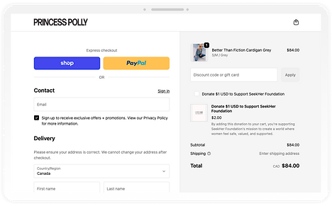
Shopify Screenshot: Princess Polly Checkout
UX patterns to intergrate
1.
Consistent price transparency
-
Display price breakdowns throughout the flow
-
Make use of an order summary side panel (desktop) or dropdown (mobile)
2.
Minimize full-page loads
-
Offer flexible navigation with one-page expand & collapse steps
3.
Streamline input & selection fields
-
Progressive disclosure for:
-
Membership feature list
-
Promo code field
-
These insights were crucial in guiding design decisions, ensuring a modern, intuitive, and efficient new checkout experience.
02
Define & Ideation
4 core issues to solve
Building on the insights from the research, there are 4 fundamental problems with the checkout experience:
📉
High drop-off rate
Friction at every step caused users to leave
💵
No price transparency
Price breakdown was shown too late, creating uncertainty
📟
Outdated flow
The 8+ year-old process felt unintuitive and untrustworthy
🫥
Hidden membership benefits
Users had to exit the flow to compare plans
"How Might We"...
...reduce abandonment rates and create a seamless membership checkout flow that provides transparency, clarity, and a smooth user experience?
User story mapping
I outlined a user story map to ensure solutions addressed key user tasks and motivations. I also wanted to make sure we were minimizing page loads through out the flow.

Low fidelity wireframes

Pick Membership:
Membership cards

Personal Details:
Expanded form

Personal Details:
Collapsed form

Order Summary:
Side panel
03
Design
Based on the research and comparative analysis, I focused on a multi-step, progressive disclosure approach for the checkout flow.
This directly addresses the issues of information overload, price transparency, and user friction identified earlier.
Applying the research
Based on our research, I synthesized key findings from usability tests, Hotjar surveys, Hotjar recordings, personal observations, and in-store experience.
To address the biggest drop-off points & pain points, I implemented design changes. Below are some of the key issues and how we addressed them:
Note: In each image below, there is a numbered 'Issue' has a corresponding 'Solution'.
Choose Membership (top of step)

Choose Membership (bottom of step)

Adding Associates / Family Members

04
Next Steps & Iterations
This project is currently in development and expected to roll out in 2026.
Development & A/B testing plan
To ensure a smooth transition, I will closely collaborate with developers & participate in design review when development is close to being finished.
Once implemented, we will run an A/B test with AB Tasty against the current flow, measuring:
-
Abandonment rate
-
Journey drop off
-
Transactions
-
Average cart $ amount
-
Specific Membership type purchases

A/B test iteration paths
