CAA
Tow truck dispatch panel: improving response times 🚨
ROLE
Sole Product Designer
TIMELINE
1.5 months (2023)
TOOLS
Figma, FigJam, Teams Meetings
Improved emergency response times by adding map filter functionality and hierarchy to the buttons and data visualization.

Overview
Background of the application
The purpose of this software was to show the roadside assistance team historical, live and predictive information about our stranded members and tow trucks all on 1 map.
Challenge
2 challenges slowed down emergency response time:
-
Map is overcrowded by showing all of this data
-
Control panel displays all the buttons and data with equal hierarchy when they all serve different purposes and priorities

Original control panel with cluttered map icons.
Solution
-
Adding filter functionality to minimize overloading the map
-
Prioritize the hierarchy of the buttons and data displayed on the control panel
Old panel

New panel

Business objectives
-
Reduce average response times
-
Improve dispatcher & control tower efficiency
-
Decrease operation error (e.g. wrong truck assignment)
Design process

01
Empathize
The goal of this stage was to
-
Understand the platform's daily challenges
-
Identify key pain points
-
Analyze what features were actually used versus ignored
I had to ensure the redesign addressed the needs without accidentally removing anything essential for any user.
Research methods
1. User interviews
The goal of the user interviews was to get a complete picture of diverse workflows and zero in on the most critical operational needs.
Targeted users
I spent time shadowing and conducting detailed interviews with all 4 primary roles who rely on the platform.
-
Dispatchers
-
Control Tower Operators
-
Supervisors
-
Account Representatives
Research objectives
The key outcomes directly informed the design strategy by clarifying:
😵💫
Critical pain points
Pinpointing specific operational needs and where the massive information overload was coming from
👩🏻💻
Design strategy
Determining which features were essential. Where can we use progressive disclosure to declutter the interface.
Key findings from user interviews
It was clear from initial observations and user feedback that its core issues stemmed from an overwhelmed and inflexible interface.

Original control panel with cluttered map icons on snowy day.
😵💫
Information overload & visual clutter
-
The map was severely crowded with icons, heatmap data, and weather information, creating severe information overload.
⚠️
Impeded response & safety risks
-
This clutter, especially during high-pressure scenarios, increased the risk of missing critical alerts, slowed decision-making, inflated training time, and introduced significant safety risks.
✍🏼
Lack of customization for diverse roles
-
A "one-size-fits-all" design failed to be diverse enough for the 4 distinct roles.
-
All essential data was presented with equal visual weight with the inability to filter or customize views.
2. User stories
From the user interviews, I created 4 user stories for each type of user that uses the system.
As a Dispatcher
I want to be able to look at all active calls, road closures, tow truck details & location
so that I can determine which tow truck is best suited to rescue, accurately communicate to tow truck and stranded person the status of their call.
As a Controller (Control tower)
I want to be able to oversee the important calls, road closures, tow truck details & location
so that I can divide the urgent calls vs. non-urgent calls and determine which tow truck is best suited to rescue, accurately communicate to tow truck and stranded person the status of their call.
As a Supervisor
I want to oversee all the calls, proactively monitor emergencies and priority rescues
so that I can mitigate potential service issues and make sure priority calls are being attended to.
As a Account Representative
I want to look at completed calls, check the history function and see tow trucks that were idle or not in licensed area
so that I can understand why calls were late and make sure that tow trucks are following the licensed area laws.
02
Define
& Ideation
Before the ideation stage, I needed to reframe the challenges as opportunities for problem-solving by creating How Might We statements.
"How Might We"...
...clear up the map & information panel so it is easier to view and manage by all roles?
...bring more awareness to the features and the power of the application through the way the data is displayed?
The solution started with the IA (Information Architecture)
The 4 user roles primarily needed either "Live" or "Historical" data. I laid out all of the features in FigJam and then based on this, I restructured the entire interface around two distinct primary functions:
-
"Live" tab for real-time incident management
-
"History" tab for reporting and past data

By segmenting the data, the interface becomes cleaner and more focused - allowing users to prioritize current critical data while keeping historical data accessible but secondary.
03
Design
I translated the Live/History IA into structural wireframes first & conducted preliminary usability tests with these.
This stage included close collaboration with the development team to ensure the concepts were feasible within the existing backend constraints.
Out of scope
System limitations didn't allow us to change any icon designs on the map.
To combat this, I added comprehensive descriptions within the panel to ensure clarity despite the icon designs, while avoiding overcrowding.

Crowded map on a snow day
Wireframe prototype usability test
I developed interactive prototypes from the wireframes for initial usability testing with the core user roles. This testing was essential for identifying friction points before moving into high-fidelity design.
Key findings from usability tests
My analysis pinpointed several critical usability issues that created friction and doubt for users:

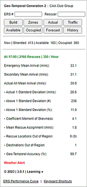
Rescued, Stranded, Available, Occupied were not used as frequently as “Mean Arrival Times”. These stats should be swapped so when the panel is collapsed, the Mean Arrival Times always show
“Refresh” button is used frequently.
Needs to be bigger and more prominent.
Checkboxes took too long to check/uncheck all calls or all trucks at once. Need to add checkboxes for each of the groups to quickly show/hide all items at once.
Control panel width was too big.
Need to show more of the map.
Mockups
Using all the findings from the wireframe usability tests, I refined and created the mockups.
Note: The Line of Business wanted to keep the colours to a minimum & didn't want to adopt CAA branding in-case they want sell the product to other companies in the future.

Live Tab

History Tab
Prototype
04
Next Steps & Iterations
Prototype usability testing
Ran 1-on-1 sessions with Dispatchers, Controllers, Supervisors, and Account Reps asking them to perform specific tasks using the mockup prototype.
UI design updates from prototype usability testing:
-
Font sizes
-
Spacing/Padding
-
Added thicker stroke to separation lines
-
Introduced colour for links to enhance usability
Learning: The amount of changes were minimal due to amount of testing we had done prior with the wireframes and mockups.
Dev design review
-
Once development was completed & during the QA stage of the project, I initiated a design review of the development work.
-
Typically we do not have one built into our process.
-
-
I addressed any discrepancies and new modifications via Figma comments.

Dev design review comments
Final learnings and reflection
This was my first time designing an application instead of a website, and it came with many learnings. It was challenging (but fun) to think differently and step into a new problem space.
Learnings:
-
Application flows are not linear. They involve many interconnected tasks rather than the hierarchical navigation typical of websites.
-
Components are more dynamic, with multiple states and interactions to support complex tasks.
-
The design approach shifts from communicating information to enabling efficient task completion.
Old panel
Looking back 1.5 years later, there are a few things I would approach differently with the experience I have now. I’d introduce more subtle colour, typography, and shading details to elevate the visual hierarchy.
I’d also be more specific in my design documentation, especially around sticky buttons and interactions, to ensure smoother collaboration with developers.
This project gave me a foundation for designing complex, task-oriented experiences, and it’s rewarding to see how much my visual and communication skills have grown since then.

New panel